Visualizing my browsing history
Motivation
Can you remember the flow of your ideas?
How do they originate, how they progress, and what do they end up as?
I can’t. I don’t even remember how I had this idea of visualizing my browsing history.
But I can know the flow of my Internet history. I can tell how I end up finding interesting sites, I can tell how my browsing habits look like.
Do I always start typing some known URLs, or do I jump deep from site to site? Are there sites I always “end up” on?
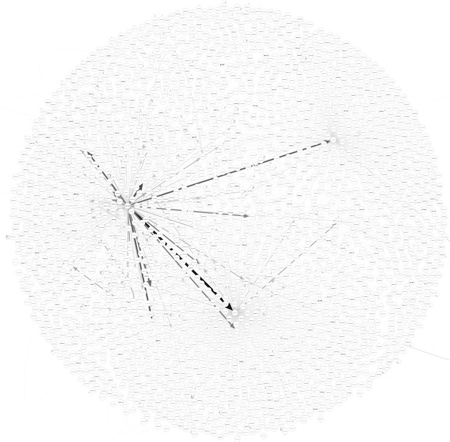
While the original idea - of tracking flow from URL to URL - is a good idea, it’s not a good visualization. To give you an idea, the graph for my history would have 120,000+ nodes. And that’s A LOT OF NODES!
So rather than tracking flow from URL to URL, I decided to track the flow from host to host.
I decided to use R, with which I have only a passing familiarity.
Getting the Data
For the graph I had in mind, I needed data which looked like this:
to: milindl.org, from: google.com, times: 20
to: google.com, from: facebook.com, times: 10
to: facebook.com, from: twitter.com, times: 5
(...continued)
With this structure of the data in mind, I set out to extract it from my browser.
I primarily use Firefox, and Firefox stores my browsing history in a SQLite
database - places.sqlite. It’s made per-profile, and for my Windows machine,
it was located at
C:\Users\<username>\AppData\Roaming\Mozilla\Firefox\Profiles\<profile name>\places.sqlite.
You can locate your own places.sqlite file using the instructions given here -
only if you’re using Firefox like me. The entire process of getting the data if you’re using Chrome will be different (and not documented here).
To keep my browing history database safe from any corruption, I made a copy to work on:
con <- dbConnect(RSQLite::SQLite(), "C:/Users/Milind/Documents/places_snapshot.sqlite")
The schema of the database is available here.
The table moz_places contains a list of all pages I’ve ever visited, along with some data about each page (including the hostname).
However, it doesn’t maintain any information about the time(s) I have visited a page.
No matter how many times I visit milindl.org, it appears only once in moz_places.
The table moz_historyvisits contains information about every visit to a page:
- an id - a numeric primary key
- a reference
place_idwhich helps me get details about the page visited - a foreign key tomoz_places - a reference
from_visitto the previous “visit” from which I came to this “visit” - a foreign key tomoz_historyvisitsitself - a
visit_type, an integer which determines how I ended up on this page - timestamp, etc.
It took some additional code reading to understand what each visit_type
corresponded to - each corresponds to a transition type, found in the file
nsINavHistoryService.idl.
There are (for the most part) two ways I might visit a page. Either I click on a link which leads to that page, or else I type the URL of the page into the address bar of the browser manually.
Clicking a link corresponds to a visit_type of 1.
Typing the URL corresponds to a visit_type of 2. For this visit_type, no from_visit is stored because I did not come from a previous visit.
Let’s look at an example for this:
- I type “http://www.milindl.org/xyz” into the address bar.
- I click on a link on the page in (1) which points to “http://www.example.com”.
- I click on a link on the page in (2) which points back to “http://www.milindl.org/xyz”.
That sequence would generate the following data:
Note that the hostnames are stored in the moz_places table in the rev_host column - and they’re
reversed. So, to get the actual hostnames, we need to reverse them later.
Putting this information together, we need two queries to get the data.
First, a query to get the list of all pages I have visited by clicking links. In this case, both
to and from are available in the tables.
We extract both the source (where I clicked the link) and target (the page I ended up on after clicking the link).
res <- dbSendQuery(con, "select p1.rev_host as target_host, p2.rev_host as source_host
                   from moz_historyvisits h1
                   join moz_historyvisits h2 on h1.from_visit == h2.id and h1.visit_type == 1
                   join moz_places p1 on h1.place_id == p1.id
                   join moz_places p2 on h2.place_id == p2.id
                   order by h1.visit_date desc;")
t1 <- dbFetch(res)
Second, a query to get a list of all the pages I have visited by typing them in the address bar.
In this case, Firefox doesn’t save a source, so we use the a constant source,
“new_tab”. So, every page visited by typing the URL in the address bar has its from
set as “new_tab”.
res <- dbSendQuery(con, "select p1.rev_host as target_host, \"bat_wen\" as source_host
    from moz_historyvisits h1
    join moz_places p1 on h1.place_id == p1.id
    where h1.visit_type == 2
    order by h1.visit_date desc;")
t2 <- dbFetch(res)
Notice that I have reversed “new_tab” in the above query - that’s to make it identical to the other hosts we are fetching, so we can reverse them together.
# Merge and clean the data.
t <- rbind(t1, t2)
t$source_host = stringi::stri_reverse(t$source_host)
t$target_host = stringi::stri_reverse(t$target_host)
t = t [, c("source_host", "target_host")]
Here’s the result:
> head(t)
          source_host         target_host
1         .igraph.org         .igraph.org
2  .music.youtube.com  .music.youtube.com
3 .cran.r-project.org .mirrors.dotsrc.org
4 .cran.r-project.org         .ftp.fau.de
5  .www.r-project.org .cran.r-project.org
6  .www.r-project.org .cran.r-project.org
We haven’t yet aggregated the data, so there are repeated entries. We will do that later in this post.
Converting it to a Graph
R has a few handy packages/primitives that help us convert this data into a directed graph.
But there is a problem - since we haven’t yet aggregated the data, there are repeated entries, which will lead to multiple edges from the same source to the same target.
This looks quite bad - rather than multiple edges from one host to another, I would want to show a thicker/darker edge. So, for now, we remove all the duplicate edges.
g1 = graph_from_data_frame(t)
g2 = simplify(g1, remove.loops = FALSE)
Now we need to calculate edge weights - we need to count how many duplicate edges were there in the original graph.
x = as.data.frame(get.edgelist(g1))
agg = as.data.frame(aggregate(x, by=list(x$V1, x$V2), FUN = length))
agg = agg[, c("Group.1", "Group.2", "V1")]
colnames(agg) = c("source", "target", "weight")
agg = as.data.frame(agg)
Here’s the result:
> tail(agg)
                    source              target weight
3604               new_tab        .zerodha.com     66
3605       .www.google.com .zerodha.quicko.com      1
3606  .www.ycombinator.com           .zinc.com      1
3607      .support.zoom.us            .zoom.us      1
3608     .kite.zerodha.com             .zrd.sh      1
3609 .news.ycombinator.com   .zwischenzugs.com      1
We need to assign this value to the actual edges of the graph we are planning to plot. (The code for this turned out to be a bit of a mess, and I’m sure there’s a better way to do it.)
E(g2)$weight = sapply(E(g2), function(e) {
  src = as.character(ends(g2,e)[1])
  tgt = as.character(ends(g2,e)[2])
  result = agg[agg$source == src & agg$target == tgt,]
  as.integer(ifelse(nrow(result) >= 1, result[1, 3], 0))
} )
Plotting the Graph
We should make a few more adjustments to make the graph nicer.
First, we need to convert the weights of the edges into two values - one, the thickness of the edge drawn on screen, and second, the color.
The edge weight distribution is quite skewed - there are a lot of edges weighted just 1 or 2, and then a few which are in the thousands.
> weights = E(g2)$weight
> summary(weights)
   Min. 1st Qu.  Median    Mean 3rd Qu.    Max.
   1.00    1.00    1.00   10.71    2.00 3613.00
It wouldn’t be a good idea at all to directly use this for the thickness, since a 3613 pixel thick edge would not be very nice to look at.
We can’t even scale it linearly - the less weighted edges would disappear.
So the only way I could think of was to scale them using a log function. Once I had that in place, I played with the constants to make it look right.
weights = E(g2)$weight
df2 = data.frame(weights)
df2$weights = log(1 + weights/max(weights) * 90)*0.5
Similarly, the color needs to be set, as well. The idea is similar - the thicker
the edge, the darker it will be. An extra pmin ensures that we don’t end up with
edges which are completely white or too light colored, since we’re using a white
background.
df2$scaled_weights = df2$weights / (max(df2$weights))
df2$inv_c = pmin(1 - df2$scaled_weights, 0.8)
df2$color = rgb(df2$inv_c, df2$inv_c, df2$inv_c)
And that’s it! The next step is to actually, finally, plot the graph. I experimented
with igraph and qgraph to plot the graph, and settled on using qgraph
I could not make igraph lay out my nodes in a good way.
I needed to play with the repulsion - a higher value of repulsion leads to
more clustering of nodes, and that led to a lot of overlapping nodes. You can
read more about it at the qgraph documentation.
png(width=15000, height=15000, "abc.png")
qgraph::qgraph(get.edgelist(g2),
    border.width=0.02,
    repulsion=0.75,
    edge.width = df2$weights,
    edge.color=df2$color)
dev.off()
Conclusions
The first thing I saw was that most of the time, rather than going from site to site to site, I rather have a few “origins”, from where I visit a multitude of sites.
The graph is much broader than it is deep.
Which are these “origins”?
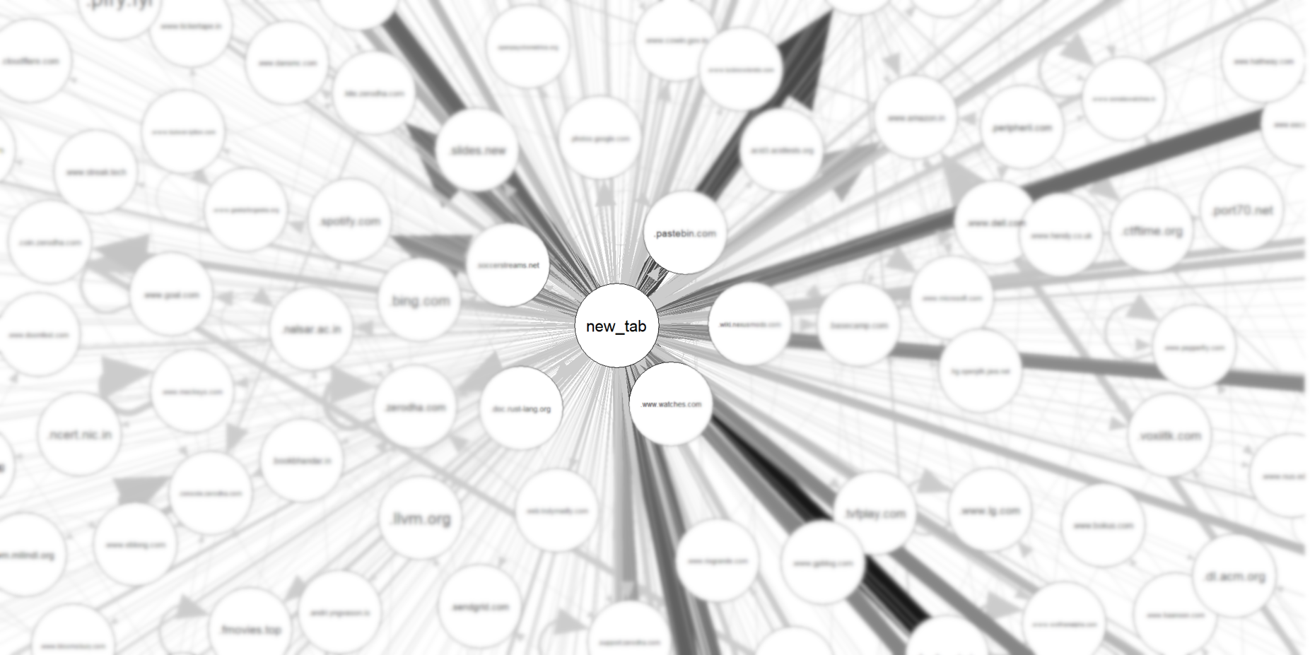
The most natural “origin” is the new_tab page - the cases where I have manually typed the URL. The other most common origins are google, and hacker news.
That means most of my browsing starts at these sites - and in most cases, the history is just one or two levels deep.
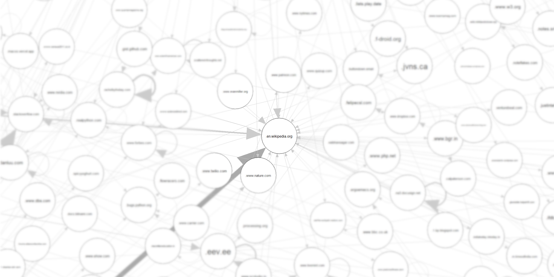 A lot of paths end up on Wikipedia.
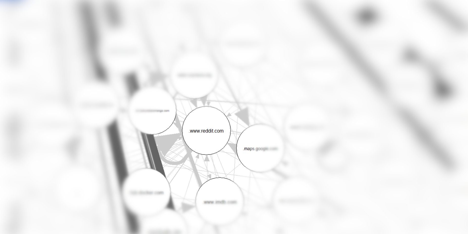 Once I get to reddit, I find it difficult to leave (see the big self-arrow?)